

When it comes to home decor, the color of the trim might not be the first thing that comes to mind, but it can make a significant impact on the overall look and feel of a room. While white has long been the go-to choice for trim and crown molding in San Ramon, there’s a growing trend of using other colors to add personality and style to interior spaces.
Let us find out whether stepping away from the traditional white trim can enhance the aesthetics of your room and bring a fresh, modern twist to your home.
Advantages of Non-White Trim Colors
When decorating a room, the trim color plays a crucial role in defining the space. While white trim is classic and versatile, opting for non-white trim colors can offer several distinct advantages that elevate your room’s design.
Adding Character and Depth
Non-white trim colors can instantly infuse a room with character and depth that white simply can’t achieve. Here’s how:
- Creates Visual Interest: A contrasting trim color draws attention to the details of the room, whether it’s framing a doorway, highlighting windows, or outlining baseboards. The contrast makes these architectural elements stand out, adding a layer of sophistication and interest.
- Sets a Mood: The trim color can influence the room’s overall mood. For example, deep, rich hues like navy or charcoal can create a cozy, intimate atmosphere, while lighter, softer tones like pastels or muted earth colors can introduce a calming, relaxed vibe.
- Personalizes the Space: Using a non-white trim color allows you to express your personal style. Whether you prefer bold, dramatic statements or subtle, understated elegance, the trim color can be tailored to reflect your unique taste.
Enhancing Architectural Features with Contrasting Trim Colors
One of the most effective ways to accentuate a room’s architectural features is by using trim colors that contrast with the wall color. This technique brings out the natural beauty of the room’s design.
- Highlighting Crown Molding and Baseboards: Darker trim colors can make crown molding and baseboards pop, emphasizing the room’s height and structure. This not only adds to the room’s elegance but also gives a sense of balance and proportion.
- Accentuating Doorways and Windows: A non-white trim around doorways and windows can create a striking visual frame, guiding the eye toward these elements. This is especially effective in rooms with high ceilings or large windows, where the trim color can enhance the room’s grandeur.
- Defining Spaces in Open-Concept Areas: In open-concept homes, different trim colors can help define distinct areas within a larger space. For example, using a different trim color in the dining area versus the living area can subtly separate these zones without needing physical barriers.
By thoughtfully selecting non-white trim colors, you can transform your room into a space that is not only visually appealing but also full of character and depth. Whether your goal is to make a bold statement or simply enhance the existing architecture, non-white trim colors provide a versatile tool for elevating your home’s interior design.
Popular Color Choices for Trim
Choosing a trim color can dramatically impact the look and feel of a room. While white is a timeless option, there’s a growing trend of using a variety of colors to create more personalized and stylish spaces. Below are some popular trim color choices, along with their effects and examples of rooms where they work particularly well.
Grays
Gray trim has become increasingly popular due to its versatility and ability to complement a wide range of wall colors.
- Effects: Gray can provide a neutral backdrop that adds sophistication and calmness to a room. It’s a modern alternative to white, offering subtle contrast without overwhelming the space.
- Where It Works: Gray trim is ideal for living rooms, dining rooms, and bedrooms, especially those with soft, muted wall colors like light blues, soft greens, or warm beiges. It also works well in spaces where you want to maintain a neutral palette with a hint of contrast.
Blacks
Black trim is bold, dramatic, and incredibly stylish. It’s a choice that makes a statement, adding depth and contrast to any room.
- Effects: Black trim frames a room with a crisp, defined edge, making architectural features stand out sharply. It adds a sense of drama and modern elegance, creating a high-contrast look that’s both striking and sophisticated.
- Where It Works: Black trim is perfect for rooms with high ceilings, large windows, or distinctive architectural features. It pairs well with light-colored walls, such as white, pale gray, or soft neutrals. You’ll often see black trim used in modern, industrial, or minimalist spaces, as well as in historic homes where it highlights the architectural details.
Bold Colors
For those looking to make a more adventurous choice, bold colors like deep blues, greens, or even reds can create a vibrant and unique look.
- Effects: Bold trim colors infuse a room with energy and personality. These colors can either complement the wall color for a harmonious look or contrast sharply to create a dynamic, eye-catching effect.
- Where It Works: Bold trim colors work well in rooms where you want to inject a sense of fun and creativity, such as playrooms, home offices, or kitchens. For example, a deep navy trim can add a nautical feel to a coastal-inspired room, while a rich emerald green trim can bring a touch of nature and luxury to a library or study.
Examples of Rooms with Non-White Trim
- Living Room with Gray Trim: In a living room with light blue walls, medium gray trim provides a subtle contrast that enhances the space’s tranquility without overpowering it. The result is a sophisticated, serene environment perfect for relaxation.
- Kitchen with Black Trim: A modern kitchen with white walls and black trim around the windows and cabinetry creates a sleek, polished look. The black trim not only adds definition but also complements stainless steel appliances, making the space feel cohesive and stylish.
- Bedroom with Navy Trim: In a bedroom with soft gray walls, navy trim can add depth and richness. This bold choice makes the room feel more intimate and cozier, ideal for a restful retreat.
By exploring these popular trim colors, you can find the perfect shade to complement your room’s design and bring out the best in your home’s architecture. Whether you choose a soft gray, a dramatic black, or a bold color, these options offer endless possibilities for enhancing your space.
Creating a Cohesive Look
When it comes to interior design, creating a cohesive look is essential for a room to feel balanced and harmonious. The trim color plays a significant role in tying together the walls, ceiling, and other elements of the space. Here are some tips on how to coordinate trim colors with wall and ceiling colors to achieve a well-integrated and aesthetically pleasing environment.
Coordinating Trim Color with Wall and Ceiling Colors
Choosing the right trim color starts with considering the colors of your walls and ceiling. Here’s how you can coordinate these elements for a seamless look:
- Matching Tones for Subtlety: If you prefer a subtle and understated design, consider selecting a trim color that is a lighter or darker shade of your wall color. This creates a soft, monochromatic look that feels cohesive without stark contrasts. For instance, if your walls are light gray, a trim color in a slightly darker gray can provide just enough distinction while maintaining harmony.
- Contrasting Colors for Impact: To make the trim a focal point, choose a color that contrasts with the wall color. For example, pairing dark trim with light walls creates a bold, eye-catching frame around windows, doors, and other architectural features. This approach works well in rooms where you want to highlight the trim as a design element in its own right.
- Neutral Ceilings for Flexibility: Often, ceilings are painted white or a light neutral color, which allows for more flexibility with trim and wall colors. A neutral ceiling can act as a balancing element in the room, preventing the space from feeling too heavy or overwhelming if you’re using bold or dark trim colors.
- Coordinating with Ceiling Color: If you decide to paint the ceiling in a color other than white, it’s important to ensure that the trim color complements it. A ceiling and trim in the same or similar color can create a unified, seamless look, especially in smaller spaces where too many contrasting elements can make the room feel cluttered.
Achieving a Balanced and Harmonious Color Scheme
To ensure your room feels balanced and harmonious, consider the following tips:
- Maintain Color Consistency: For a cohesive look, it’s important to maintain consistency in the color scheme throughout the room. If you’re using a non-white trim color, consider how that color relates to other elements in the room, such as furniture, fabrics, and accessories. For example, a gray trim could be echoed in a rug, throw pillows, or artwork, tying the whole room together.
- Use Color Theory: Understanding basic color theory can help you choose complementary or analogous colors that work well together. Complementary colors (those opposite each other on the color wheel, like blue and orange) create a vibrant contrast, while analogous colors (those next to each other on the color wheel, like blue and green) provide a more harmonious and calming effect.
- Balance Bold Choices with Neutrals: If you’re using a bold trim color, balance it with neutral walls or ceiling colors to prevent the room from feeling too intense. This balance helps to ground the space, making it more visually comfortable and inviting.
- Consider the Room’s Purpose: The function of the room should guide your color choices. For example, in a bedroom, where relaxation is key, softer, more harmonious color schemes with subtle trim contrasts can create a peaceful atmosphere. In contrast, a home office might benefit from more dynamic color contrasts to foster creativity and energy.
By thoughtfully coordinating your trim color with wall and ceiling colors and considering the overall color scheme, you can create a room that feels balanced, cohesive, and visually appealing. Whether you opt for subtle, matching tones or bold contrasts, the key is to ensure that all elements work together to create a harmonious space that reflects your personal style.
Highlighting and Accentuating Features
The trim in a room is more than just a finishing touch; it can be a powerful tool to highlight and accentuate architectural details, adding depth and interest to the space. By carefully choosing and applying trim color, you can draw attention to specific features like windows, doors, and moldings, transforming them from functional elements into focal points.
Using Trim Color to Draw Attention to Architectural Details
Trim color can make a significant impact by emphasizing the architectural character of a room. Here’s how you can use trim color to draw attention to specific features:
- Creating Contrast: One of the most effective ways to highlight architectural details is by choosing a trim color that contrasts with the wall color. For example, if your walls are painted in a soft, neutral tone, selecting a dark or vibrant trim color will make the trim stand out, immediately drawing the eye to the windows, doors, and moldings.
- Complementing Architectural Style: The trim color can also be used to complement and enhance the room’s architectural style. For example, in a traditional or historic home, deep, rich trim colors like burgundy, navy, or forest green can highlight the craftsmanship of ornate moldings and woodwork. In contrast, a sleek, modern space might benefit from crisp, bold black or dark gray trim to accentuate clean lines and minimalist features.
- Enhancing Proportions: Trim color can help to visually alter the proportions of a room. For instance, using a darker trim color on the lower half of the walls (such as on wainscoting or baseboards) with a lighter color above can make a room feel taller and more spacious. Conversely, a darker ceiling trim or crown molding can bring the ceiling visually lower, creating a more intimate and cozy atmosphere.
Tips on Highlighting Windows, Doors, and Moldings with Color
To make the most of your trim color, consider these tips for highlighting key architectural elements:
- Windows: Highlighting windows with a contrasting trim color can make them a focal point in the room. Dark trim around windows, especially in rooms with light walls, creates a picture frame effect, drawing attention to the view outside or the design of the window itself. For a more subtle effect, choosing a trim color that is just a shade or two darker than the wall color can still provide definition without overpowering the space.
- Doors: Doors are another architectural element that can be accentuated with color. Painting door trim in a bold color can make the entrance stand out, serving as a statement piece in the room. In a hallway, using the same trim color on all doors can create a cohesive look, while a contrasting trim on just one door can draw attention to a specific area, such as an entryway or closet.
- Moldings: Crown molding, baseboards, and other moldings are perfect candidates for color accents. If your room has intricate molding, painting it in a color that contrasts with the walls will make the details pop, showcasing the craftsmanship. In contemporary spaces, using a single, uniform trim color for all moldings can create a sleek, unified appearance that enhances the room’s architecture without adding visual clutter.
- Accent Walls: If you have an accent wall in your room, consider using a coordinating trim color to tie the accent wall into the rest of the space. For example, if your accent wall is a deep blue, using a slightly lighter or darker shade of blue for the trim around the windows and doors on that wall can enhance the overall effect.
- Highlighting Unique Features: If your room has unique architectural features like built-in bookshelves, a fireplace, or exposed beams, using a contrasting trim color can make these elements stand out. For example, a fireplace with a richly colored mantel can be further highlighted with trim that either matches the mantel color or contrasts with both the wall and mantel.
By thoughtfully choosing and applying trim color, you can effectively highlight and accentuate the architectural details in your room. Whether you aim to create subtle enhancements or bold statements, using color on your trim is a powerful way to add personality and character to your space.
Practical Considerations
When it comes to painting trim, selecting the right paint finish and type is just as important as choosing the color. The right finish can enhance the appearance of the trim, while proper painting techniques can ensure a smooth, professional-looking result. Here’s a guide to making the best practical choices for your trim project.
Choosing the Right Finish and Type of Paint for Trim
The finish and type of paint you choose for your trim will affect both the look and durability of the trim. Here’s what to consider:
Finish Options:
- Semi-Gloss: Semi-gloss is one of the most popular choices for trim because it offers a subtle sheen that highlights the trim without being too shiny. It’s durable, easy to clean, and resistant to scuffs and stains, making it ideal for high-traffic areas like door frames and baseboards.
- Gloss: Glossy finishes have a higher shine than semi-gloss, providing a sleek, polished look. They’re particularly good at reflecting light, which can make rooms feel brighter. Gloss finishes are also very durable and easy to clean, making them a great choice for trim in kitchens, bathrooms, and other areas that require frequent cleaning.
- Satin: Satin finishes have a lower sheen than semi-gloss, offering a more understated look while still being easier to clean than flat or matte finishes. Satin is a good option if you want a softer appearance for your trim, particularly in living rooms or bedrooms where a less reflective surface might be preferred.
Type of Paint:
- Water-Based (Latex) Paint: Water-based paints are the most common choice for trim because they dry quickly, have low odor, and are easy to clean up with soap and water. Modern latex paints are highly durable and can provide a smooth finish on trim, making them suitable for most interior projects.
- Oil-Based Paint: Oil-based paints are known for their durability and smooth finish, which can be especially appealing for trim with intricate details. However, they take longer to dry, have a stronger odor, and require mineral spirits for cleanup. Despite these drawbacks, oil-based paints are still preferred by some professionals for their hard, durable finish.
- Hybrid (Alkyd) Paint: Alkyd paints offer the benefits of both oil and water-based paints. They provide a smooth, durable finish similar to oil-based paint but have the easier cleanup and lower odor of latex paint. These paints are a good option if you want the durability of oil-based paint without the hassle.
Practical Tips for Painting Trim Effectively and Efficiently
Once you’ve selected the right paint and finish, the next step is to ensure you apply it effectively. Here are some practical tips for achieving the best results:
Prep the Surface:
- Clean the Trim: Before painting, make sure the trim is clean and free of dust, dirt, and grease. Use a damp cloth with a mild detergent to wipe down the trim and allow it to dry completely.
- Sand the Surface: Lightly sand the trim to create a smooth surface and remove any gloss from the previous paint. This step helps the new paint adhere better. Use fine-grit sandpaper and wipe away dust with a tack cloth after sanding.
- Fill Gaps and Holes: Use caulk to fill any gaps between the trim and the wall, and apply wood filler to fill in any holes or dents. Sand the filled areas smooth once dry.
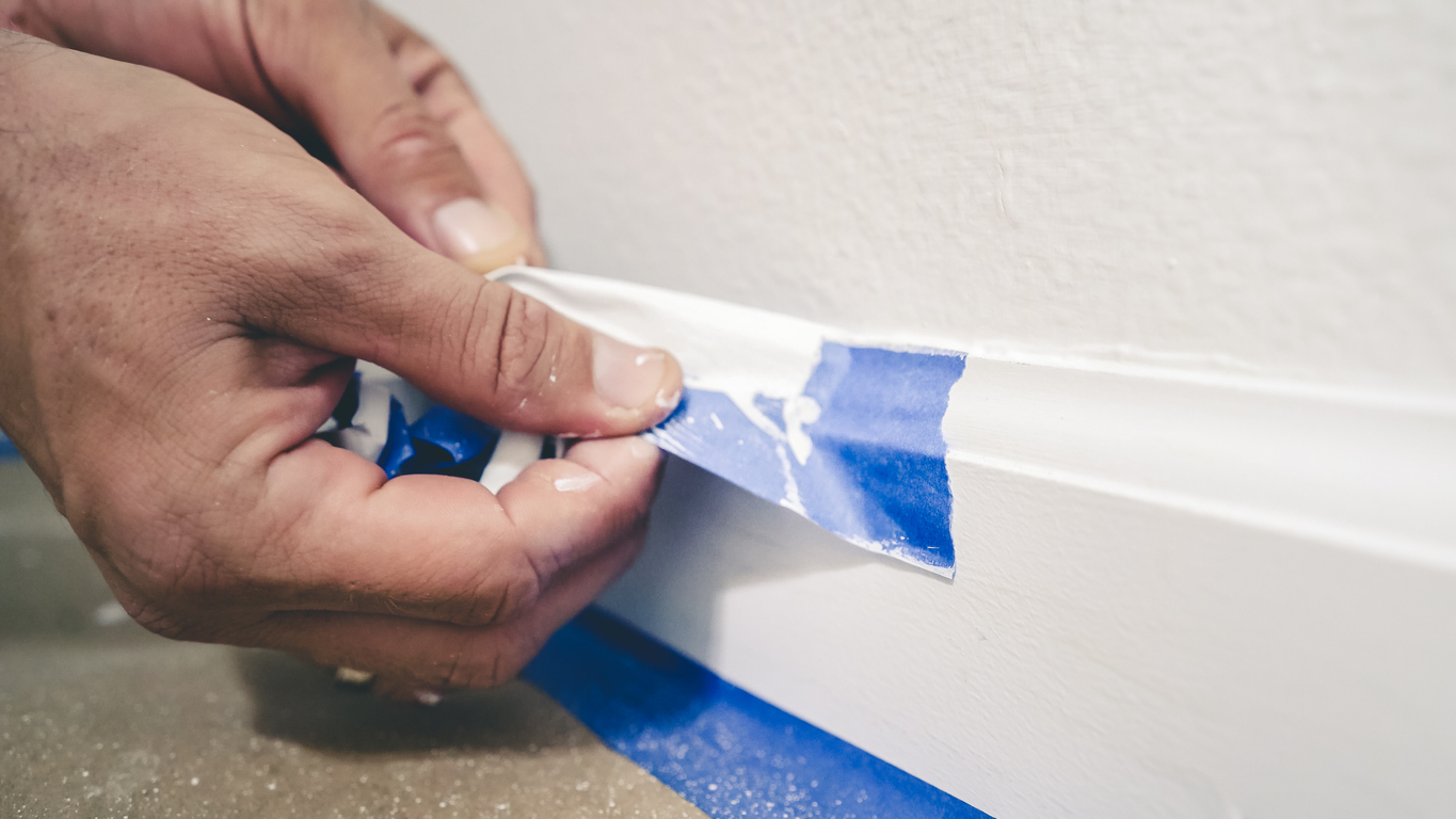
- Use Painter’s Tape: Apply painter’s tape along the edges of the trim to protect the walls and create clean, sharp lines. Make sure to press down the edges of the tape firmly to prevent paint from seeping underneath.
- Prime the Trim: If you’re painting over dark or stained trim, or if the trim is made of raw wood, apply a coat of primer first. Primer helps the paint adhere better and ensures a uniform finish, especially when transitioning from a dark to a light color.
Apply the Paint:
- Brush Technique: Use a high-quality angled brush for painting trim. Dip the brush about one-third of the way into the paint, and wipe off the excess on the edge of the can. Apply the paint in long, smooth strokes, following the direction of the trim. Avoid overloading the brush, which can cause drips and uneven coverage.
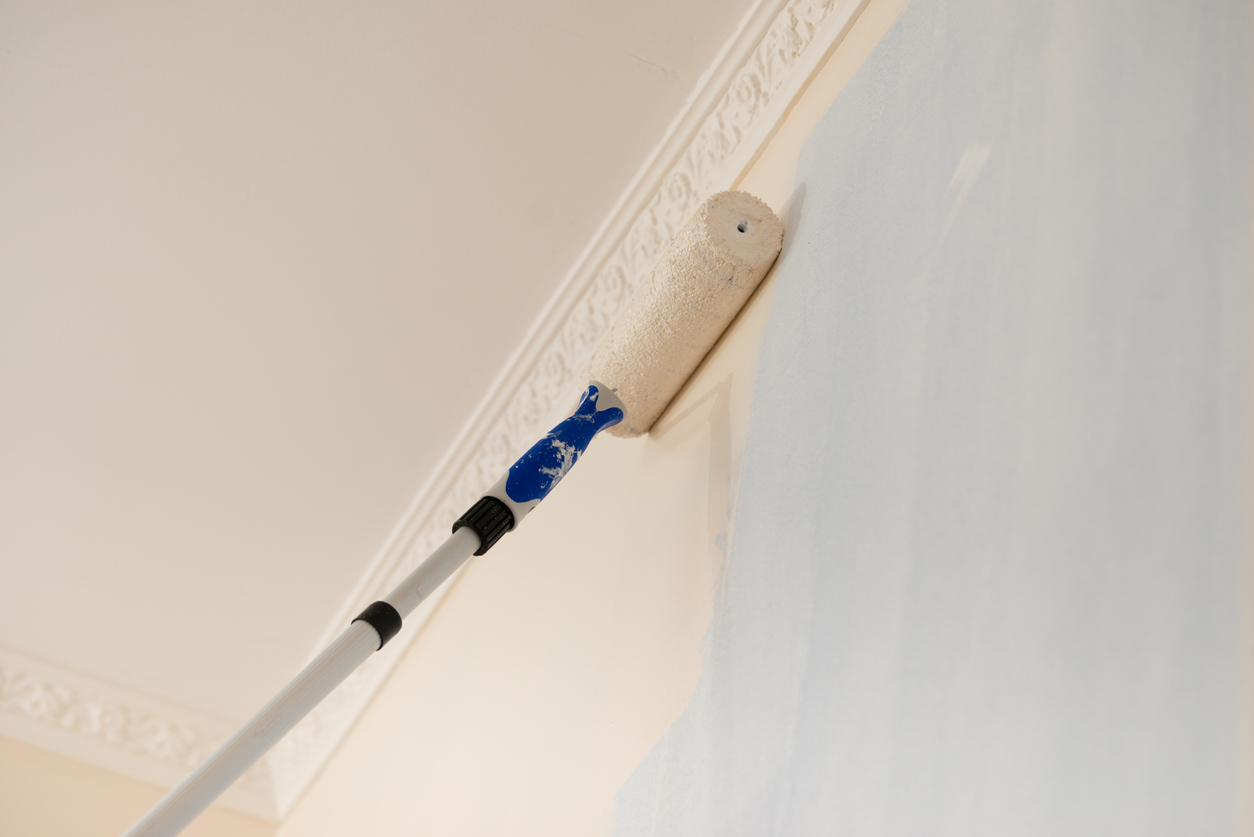
- Roller Technique: For flat, wide trim, you can use a small foam roller to apply the paint. This technique provides a smooth, even finish without brush marks. After rolling on the paint, use a brush to lightly “tip off” the paint, which smooths out any roller texture.
- Multiple Coats: Apply two coats of paint for the best coverage and durability. Allow the first coat to dry completely before applying the second.
- Remove Tape Carefully: After the final coat has dried, carefully remove the painter’s tape by pulling it away from the trim at a 45-degree angle. Do this slowly to avoid peeling off any paint.
- Touch-Up: Inspect the trim once the paint is dry and touch up any areas where the paint may have been uneven or where there are small imperfections.
By choosing the right paint finish and type and following these practical painting tips, you can achieve a professional-looking trim that enhances the overall beauty of your room. Proper preparation and careful application are key to ensuring that your trim looks smooth, clean, and beautifully finished.
Final Thoughts
Choosing the right trim color can transform your space, adding character, highlighting architectural features, and creating a cohesive look. Whether you opt for subtle neutrals or bold contrasts, the possibilities are endless. If you have any questions or need expert advice on selecting and painting trim, contact Custom Painting, Inc. at 925-866-9610 or fill out our contact form to schedule a consultation. Let us bring your vision to life.