

When it comes to giving your kitchen a fresh new look, choosing the right color is crucial. The colors you select can set the mood, make the space feel larger, and even influence how appetizing your meals appear. This article explores the most popular colors used for repainting kitchens, offering insights into why these shades are favored and how they can transform your cooking space. Whether you’re aiming for a modern, classic, or cozy vibe, understanding these common kitchen colors will help you make an informed decision for your next painting project.
The Psychology of Kitchen Colors
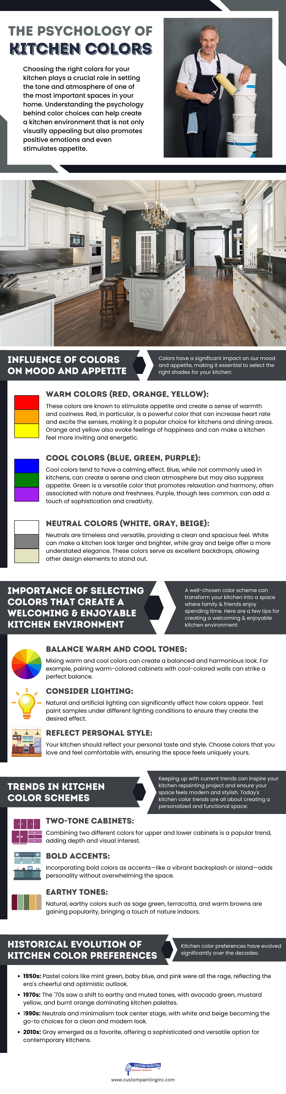
Choosing the right colors for your kitchen plays a crucial role in setting the tone and atmosphere of one of the most important spaces in your home. Understanding the psychology behind color choices can help create a kitchen environment that is not only visually appealing but also promotes positive emotions and even stimulates appetite.
1. Influence of Colors on Mood and Appetite
Colors have a significant impact on our mood and appetite, making it essential to select the right shades for your kitchen:
- Warm Colors (Red, Orange, Yellow): These colors are known to stimulate appetite and create a sense of warmth and coziness. Red, in particular, is a powerful color that can increase heart rate and excite the senses, making it a popular choice for kitchens and dining areas. Orange and yellow also evoke feelings of happiness and can make a kitchen feel more inviting and energetic.
- Cool Colors (Blue, Green, Purple): Cool colors tend to have a calming effect. Blue, while not commonly used in kitchens, can create a serene and clean atmosphere but may also suppress appetite. Green is a versatile color that promotes relaxation and harmony, often associated with nature and freshness. Purple, though less common, can add a touch of sophistication and creativity.
- Neutral Colors (White, Gray, Beige): Neutrals are timeless and versatile, providing a clean and spacious feel. White can make a kitchen look larger and brighter, while gray and beige offer a more understated elegance. These colors serve as excellent backdrops, allowing other design elements to stand out.
2. Importance of Selecting Colors that Create a Welcoming and Enjoyable Kitchen Environment
A well-chosen color scheme can transform your kitchen into a space where family and friends enjoy spending time. Here are a few tips for creating a welcoming and enjoyable kitchen environment:
- Balance Warm and Cool Tones: Mixing warm and cool colors can create a balanced and harmonious look. For example, pairing warm-colored cabinets with cool-colored walls can strike a perfect balance.
- Consider Lighting: Natural and artificial lighting can significantly affect how colors appear. Test paint samples under different lighting conditions to ensure they create the desired effect.
- Reflect Personal Style: Your kitchen should reflect your personal taste and style. Choose colors that you love and feel comfortable with, ensuring the space feels uniquely yours.
3. Trends in Kitchen Color Schemes
Keeping up with current trends can inspire your kitchen repainting project and ensure your space feels modern and stylish. Today’s kitchen color trends are all about creating a personalized and functional space:
- Two-Tone Cabinets: Combining two different colors for upper and lower cabinets is a popular trend, adding depth and visual interest.
- Bold Accents: Incorporating bold colors as accents—like a vibrant backsplash or island—adds personality without overwhelming the space.
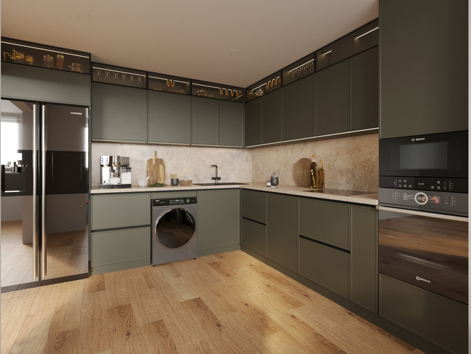
- Earthy Tones: Natural, earthy colors such as sage green, terracotta, and warm browns are gaining popularity, bringing a touch of nature indoors.
4. Historical Evolution of Kitchen Color Preferences
Kitchen color preferences have evolved significantly over the decades:
- 1950s: Pastel colors like mint green, baby blue, and pink were all the rage, reflecting the era’s cheerful and optimistic outlook.
- 1970s: The ’70s saw a shift to earthy and muted tones, with avocado green, mustard yellow, and burnt orange dominating kitchen palettes.
- 1990s: Neutrals and minimalism took center stage, with white and beige becoming the go-to choices for a clean and modern look.
- 2010s: Gray emerged as a favorite, offering a sophisticated and versatile option for contemporary kitchens.
By understanding the psychology of colors and staying informed about current trends, you can create a kitchen that is both functional and aesthetically pleasing, making it the heart of your home.
Popular Neutral Colors
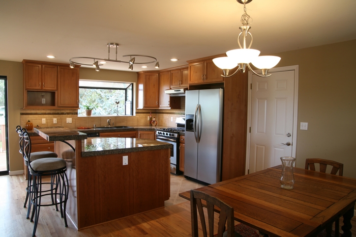
Neutral colors are a favorite choice for kitchens due to their timeless appeal and versatility. They provide a perfect backdrop that complements various styles and allows other design elements to shine. Among the popular neutral colors, classic whites, off-whites, soft grays, and beiges stand out for their ability to create a warm and inviting kitchen environment.
1. Classic Whites and Off-Whites
White and off-white are classic choices for kitchens, offering numerous benefits:
- Timeless Appeal: White and off-white never go out of style. They provide a clean and fresh look that remains elegant and relevant through changing trends.
- Versatility: These colors can easily match with various kitchen styles, from modern and minimalist to traditional and farmhouse.
- Enhances Light: White and off-white reflect natural and artificial light, making the kitchen appear brighter and more inviting.
Here are some examples of how these colors can make a kitchen appear larger and brighter:
- Expanding Space: Light colors like white and off-white can make a small kitchen feel more spacious. By reflecting more light, they create an illusion of a larger area.
- Brightening Effect: Kitchens with limited natural light can benefit from white and off-white colors. They amplify the available light, reducing shadows and creating a more open and airy atmosphere.
- Creating a Clean Canvas: White and off-white provide a neutral backdrop that allows other design elements, like colorful backsplashes or decorative accents, to stand out without overwhelming the space.
2. Soft Grays and Beiges
Soft grays and beiges are popular for their ability to create a warm and inviting kitchen:
- Subtle Elegance: These colors add a touch of sophistication and understated elegance to any kitchen, making it feel cozy yet stylish.
- Flexibility: Grays and beiges are highly adaptable, blending seamlessly with various materials such as wood, metal, and stone. They can serve as a perfect canvas for both bold and muted accents.
- Comforting Atmosphere: These colors evoke a sense of calm and relaxation, making the kitchen a pleasant place to spend time in.
Here are a few tips for selecting the right shade to complement different kitchen styles:
- Consider Lighting: The amount and type of light in your kitchen can significantly influence how grays and beiges appear. Test different shades under various lighting conditions to find the perfect match.
- Match with Cabinetry: If you have wooden cabinets, choose a gray or beige with undertones that complement the wood’s natural color. For painted cabinets, ensure the tones blend harmoniously.
- Pair with Accents: Use soft grays and beiges as a neutral base, and then add pops of color through accessories, appliances, or backsplash tiles to create visual interest.
- Coordinate with Flooring: Ensure the chosen shade of gray or beige coordinates well with your kitchen flooring to create a cohesive look.
By selecting popular neutral colors like classic whites, off-whites, soft grays, and beiges, you can create a kitchen that feels welcoming, stylish, and timeless. These colors provide a versatile foundation that adapts to various styles and trends, ensuring your kitchen remains beautiful for years to come.
Bold and Vibrant Colors
Bold and vibrant colors can transform a kitchen into a lively and stimulating space full of energy and personality. From energetic reds and oranges to calming blues and greens, these colors can significantly impact the overall ambiance of your kitchen.
1. Energetic Reds and Oranges
Red and orange are dynamic colors that can infuse your kitchen with energy and warmth:
- Stimulating Environment: Red is known to increase energy levels and stimulate appetite, making it an excellent choice for kitchens. It can create a vibrant and exciting atmosphere that encourages social interaction and activity.
- Warmth and Vitality: Orange combines the energy of red with the cheerfulness of yellow, bringing a sense of warmth and vitality to the space. It can make the kitchen feel more inviting and cozy.
Here are some examples of using these colors as accents or focal points:
- Accent Walls: Painting one wall in a bold red or orange can serve as a striking focal point without overwhelming the space. This approach adds a burst of color while keeping the overall look balanced.
- Cabinetry: For a bold statement, consider red or orange cabinetry. This can create a modern and stylish look that stands out. If full cabinets feel too intense, consider just the kitchen island or upper cabinets in these vibrant tones.
- Backsplashes and Accessories: Incorporate red or orange through backsplashes, bar stools, or small appliances. These accents can add pops of color and personality to a neutral kitchen.
2. Calming Blues and Greens
Blue and green are soothing colors that can create a calm and refreshing kitchen environment:
- Tranquil Atmosphere: Blue is known for its calming effects, helping to create a serene and peaceful kitchen. It can also evoke a sense of cleanliness and order, making the space feel more organized.
- Natural Refreshment: Green brings the outdoors inside, promoting relaxation and a sense of renewal. It is often associated with health and well-being, making it a great choice for a kitchen where fresh, healthy food is prepared.
Here are some tips for incorporating these colors in cabinetry, walls, and accessories:
- Cabinetry: Light blue or pastel green cabinets can create a fresh and airy feel, perfect for a cottage or coastal-inspired kitchen. For a more dramatic look, consider deeper shades of navy blue or forest green.
- Walls: Soft blues and greens can make the kitchen feel spacious and light. Consider using these colors on the walls to create a calming backdrop that pairs well with white or natural wood accents.
- Accessories: Introduce blue and green through kitchen accessories like dishware, curtains, or rugs. These subtle touches can enhance the overall color scheme without dominating the space.
- Tiles and Backsplashes: Blue and green tiles can add a refreshing touch to your backsplash or flooring. They can provide a cool contrast to warmer wood tones or complement stainless steel appliances for a sleek look.
By incorporating bold and vibrant colors like energetic reds and oranges or calming blues and greens, you can create a kitchen that reflects your personality and enhances your cooking experience. Whether you opt for bold accents or a more subtle integration, these colors can bring your kitchen to life and make it a space where you love to spend time.
Elegant and Sophisticated Hues
Elegant and sophisticated hues can elevate your kitchen, creating a space that exudes class and refinement. Deep blues, navy, rich charcoals, and blacks are among the top choices for achieving a high-end look. These colors, when used thoughtfully, can transform your kitchen into a luxurious and stylish area.
1. Deep Blues and Navy
Dark blues, such as navy, are known for their ability to impart a sense of depth and sophistication:
- Sophistication and Elegance: Deep blues are associated with elegance and timelessness. They can create a serene yet luxurious atmosphere, making the kitchen feel more upscale and polished.
- Versatile and Timeless: Navy and other dark blues are versatile and work well with various styles, from traditional to contemporary. They add a touch of formality and can make the kitchen feel more curated and designed.
Here are some ways to pair dark blues with contrasting elements:
- White Countertops: Pairing deep blue cabinetry or walls with white countertops creates a stunning contrast that highlights both colors. The brightness of the white balances the darkness of the blue, keeping the kitchen from feeling too heavy.
- Brass Fixtures: Brass fixtures, such as faucets, handles, and light fixtures, add a warm, metallic contrast to dark blue hues. The combination of navy and brass exudes a classic, timeless charm while adding a touch of glamour.
2. Rich Charcoals and Blacks
Charcoal and black are bold choices that can dramatically transform a kitchen:
- Modernity and Drama: Black and charcoal hues bring a sense of modernity and drama. They create a strong, sophisticated statement that can make the kitchen feel cutting-edge and stylish.
- Luxurious Appeal: These dark hues are often associated with luxury and exclusivity. They can give the kitchen a high-end, designer feel, making it look both opulent and contemporary.
Here are ways to balance dark hues with light and reflective surfaces for a balanced look:
- Light Countertops and Backsplashes: Balance the depth of black or charcoal with light-colored countertops and backsplashes. Materials like white marble, quartz, or light-colored tiles can prevent the kitchen from feeling too dark and closed in.
- Reflective Surfaces: Incorporate reflective surfaces like glossy cabinets, stainless steel appliances, or mirrored backsplashes. These elements reflect light, adding brightness and depth to the space, creating a more balanced and inviting environment.
- Natural Light: Maximize natural light through large windows or skylights to keep the kitchen feeling airy and open. The interplay of natural light with dark hues can create a dramatic yet harmonious effect.
By integrating elegant and sophisticated hues like deep blues, navy, rich charcoals, and blacks, you can craft a kitchen that is both stylish and luxurious. These colors, when paired with contrasting and reflective elements, create a balanced and visually stunning space that speaks of modernity and timeless elegance.
Complementary Color Combinations
Using complementary color combinations in your kitchen can create a visually engaging and harmonious space. Two-tone cabinets and accent walls or backsplashes are effective ways to introduce complementary colors, adding depth, interest, and focal points to your kitchen design.
1. Two-Tone Cabinets
Two-tone cabinets are a popular design choice for modern kitchens, offering a way to break up the monotony and add visual interest:
- White and Darker Colors: One of the most popular combinations is white upper cabinets paired with darker lower cabinets, such as navy, charcoal, or deep green. This pairing creates a balanced look, with the white upper cabinets keeping the kitchen light and airy while the darker lower cabinets add depth and sophistication.
- Contrasting Colors: Other combinations include soft grays with bold colors like teal or mustard and natural wood tones with painted finishes. These pairings can highlight the kitchen’s architectural features and add a unique character.
Here are the benefits that you can get from two-tone cabinets:
- Visual Depth: Two-tone cabinets create a layered look that adds depth to the kitchen, making it more visually appealing. The contrast between the upper and lower cabinets can make the space feel more dynamic and less uniform.
- Design Flexibility: This approach allows for greater design flexibility. You can choose colors that reflect your personal style or follow current trends, ensuring your kitchen feels updated and personalized.
- Highlighting Features: Two-tone cabinets can draw attention to specific areas of the kitchen, such as a central island or a feature wall, making these elements stand out as focal points.
2. Accent Walls and Backsplashes
Accent walls and backsplashes are perfect for adding bold colors or patterns to your kitchen without overwhelming the space:
- Bold Colors: Choose a bold color for an accent wall to create a striking focal point. Colors like deep red, bright turquoise, or rich mustard can add vibrancy and energy to the kitchen.
- Patterns and Textures: Consider using patterned tiles or textured materials for the backsplash. Geometric patterns, mosaic tiles, or even a mural can serve as a captivating backdrop that enhances the overall design.
Here are tips for selecting complementary colors that enhance the overall kitchen design:
- Color Wheel Basics: Use the color wheel to find complementary colors. Colors opposite each other on the wheel, like blue and orange or green and red, create a balanced and pleasing contrast.
- Balance and Proportion: Ensure that the use of bold colors or patterns is balanced. If you have a bold accent wall, keep the rest of the kitchen more neutral to avoid overwhelming the space.
- Cohesive Palette: Choose colors that complement the existing palette of your kitchen. Consider the colors of your cabinets, countertops, and flooring when selecting accent colors to ensure a cohesive look.
- Test Samples: Before committing, test paint samples or tile swatches in your kitchen. Observe how they look under different lighting conditions to ensure they achieve the desired effect.
By incorporating complementary color combinations through two-tone cabinets and accent walls or backsplashes, you can create a kitchen that is stylish and harmonious. These design choices add depth, interest, and focal points, enhancing the overall aesthetic and making your kitchen a more enjoyable space.
Practical Considerations
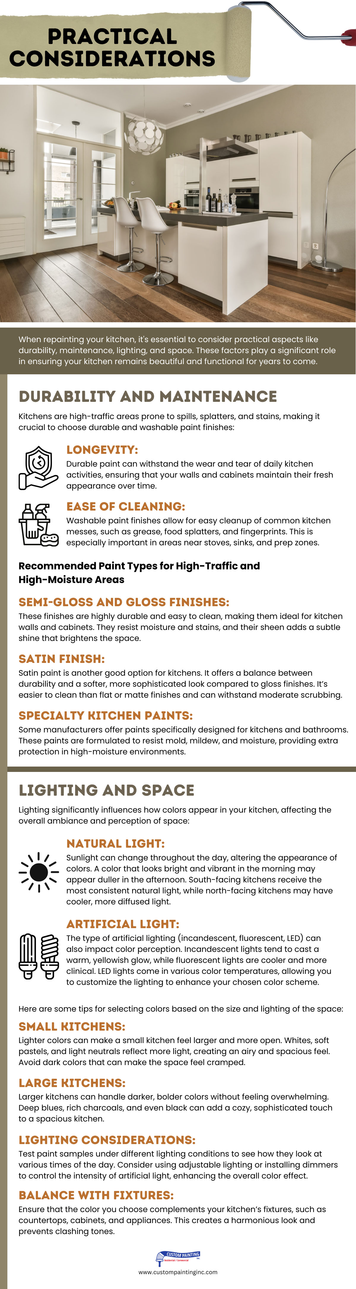
When repainting your kitchen, it’s essential to consider practical aspects like durability, maintenance, lighting, and space. These factors play a significant role in ensuring your kitchen remains beautiful and functional for years to come.
1. Durability and Maintenance
Kitchens are high-traffic areas prone to spills, splatters, and stains, making it crucial to choose durable and washable paint finishes:
- Longevity: Durable paint can withstand the wear and tear of daily kitchen activities, ensuring that your walls and cabinets maintain their fresh appearance over time.
- Ease of Cleaning: Washable paint finishes allow for easy cleanup of common kitchen messes, such as grease, food splatters, and fingerprints. This is especially important in areas near stoves, sinks, and prep zones.
2. Recommended Paint Types for High-Traffic and High-Moisture Areas
- Semi-Gloss and Gloss Finishes: These finishes are highly durable and easy to clean, making them ideal for kitchen walls and cabinets. They resist moisture and stains, and their sheen adds a subtle shine that brightens the space.
- Satin Finish: Satin paint is another good option for kitchens. It offers a balance between durability and a softer, more sophisticated look compared to gloss finishes. It’s easier to clean than flat or matte finishes and can withstand moderate scrubbing.
- Specialty Kitchen Paints: Some manufacturers offer paints specifically designed for kitchens and bathrooms. These paints are formulated to resist mold, mildew, and moisture, providing extra protection in high-moisture environments.
3. Lighting and Space
Lighting significantly influences how colors appear in your kitchen, affecting the overall ambiance and perception of space:
- Natural Light: Sunlight can change throughout the day, altering the appearance of colors. A color that looks bright and vibrant in the morning may appear duller in the afternoon. South-facing kitchens receive the most consistent natural light, while north-facing kitchens may have cooler, more diffused light.
- Artificial Light: The type of artificial lighting (incandescent, fluorescent, LED) can also impact color perception. Incandescent lights tend to cast a warm, yellowish glow, while fluorescent lights are cooler and more clinical. LED lights come in various color temperatures, allowing you to customize the lighting to enhance your chosen color scheme.
Here are some tips for selecting colors based on the size and lighting of the space:
- Small Kitchens: Lighter colors can make a small kitchen feel larger and more open. Whites, soft pastels, and light neutrals reflect more light, creating an airy and spacious feel. Avoid dark colors that can make the space feel cramped.
- Large Kitchens: Larger kitchens can handle darker, bolder colors without feeling overwhelming. Deep blues, rich charcoals, and even black can add a cozy, sophisticated touch to a spacious kitchen.
- Lighting Considerations: Test paint samples under different lighting conditions to see how they look at various times of the day. Consider using adjustable lighting or installing dimmers to control the intensity of artificial light, enhancing the overall color effect.
- Balance with Fixtures: Ensure that the color you choose complements your kitchen’s fixtures, such as countertops, cabinets, and appliances. This creates a harmonious look and prevents clashing tones.
By considering durability, maintenance, lighting, and space, you can choose the right colors and finishes for your kitchen that not only look great but also stand up to daily use. These practical considerations ensure that your kitchen remains a beautiful and functional space for years to come.
Final Thought
A well-chosen color scheme has the power to transform your kitchen, turning it into a space that is not only functional but also beautiful and inviting. Whether you opt for classic neutrals, bold and vibrant hues, or elegant and sophisticated tones, the right colors can enhance your kitchen’s atmosphere, making it a place where family and friends love to gather.
Ready to give your kitchen a fresh new look? Contact Custom Painting, Inc. at 925-866-9610 or reach out through our contact form. Our team of experts is here to help you choose the perfect colors and bring your vision to life. Transform your kitchen today and enjoy a space that truly reflects your style and personality.