

Choosing the right paint color for your Danville, CA area home can feel overwhelming. With so many options, it’s easy to get stuck trying to find the perfect shade. But don’t worry—picking the right color doesn’t have to be stressful. Whether you’re drawn to bold, vibrant hues or prefer soothing neutrals, understanding the basics of color selection can make the process much simpler. With the help of a professional painting contractor, you can turn your color ideas into a beautiful reality that reflects your style and enhances your space.
1. Start with Colors You Love
The best place to start when choosing interior paint colors is with the colors you already love. Think about your favorite hues that make you feel happy, relaxed, or energized. These colors are a great foundation for your home because they reflect your personality and make the space uniquely yours.
For example, if you love shades of blue, consider using them as a base for your living room or bedroom. From there, you can build a color scheme that complements your favorite shade—maybe pairing it with soft grays, crisp whites, or even a bold accent color like mustard yellow.
Don’t worry too much about following traditional color schemes. The beauty of starting with what you love is that it gives you creative freedom. Whether your taste leans toward vibrant reds or calming greens, you can craft a palette that feels cohesive and true to your style.
The key is to use your favorite color as a starting point, then expand on it with complementary tones that bring out the best in your space.
2. Understand Color Psychology
Did you know that the colors you choose for your home affect your mood and energy levels? It’s true! Color psychology is all about understanding how different shades can influence how we feel in a space.
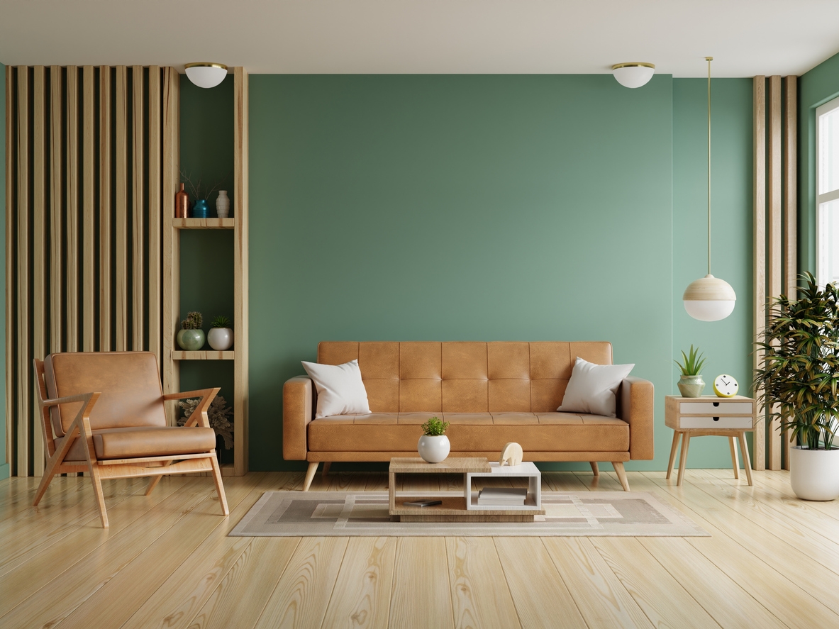
For instance, soft blues and greens are known for their calming effects, making them perfect for bedrooms or any room where you want to relax and unwind. These colors can create a serene atmosphere that helps you de-stress after a long day.
On the other hand, if you want to add more energy to a space, consider warmer colors like reds, oranges, and yellows. These hues are great for areas like the kitchen or living room, where you want to feel lively and inspired. Warm colors can also make a space feel more inviting and cozy.
It’s also essential to think about the function of each room. For example, if you want your home office to boost productivity, you might choose a color like green, which promotes focus and balance. In contrast, a dining room painted in a rich, warm color like deep red can stimulate conversation and appetite.
3. Consider the Function of the Space
When choosing paint colors, it’s essential to think about how you use each room. The function of space should guide your color choices, ensuring that the atmosphere aligns with the activities that happen there. Here are our suggestions for each type of space:
Calm and Restful Spaces
For rooms where you relax, like bedrooms and living rooms, choose colors that promote calm and comfort. Soft blues, gentle greens, and neutral tones create a peaceful environment perfect for unwinding. These colors are known to reduce stress and can make a space feel like a true sanctuary.
Energetic and Social Spaces
In contrast, areas where you entertain or need a boost of energy, like kitchens and dining rooms, can benefit from warmer colors. Reds, oranges, and yellows are known to stimulate appetite and conversation, making them excellent choices for spaces where you gather with family and friends. These colors can make your home feel lively and welcoming.
Focused and Productive Spaces
For spaces where focus and productivity are key, such as home offices or study areas, consider colors that enhance concentration. Greens and blues are often recommended because they promote balance and clarity. These shades can help you stay calm and focused, even during busy workdays.
Flexible Spaces
If you have a room that serves multiple purposes, such as a guest room that doubles as an office, choose a versatile color that works well in both scenarios. Soft neutrals or light grays can provide a neutral backdrop that’s both soothing and conducive to productivity.
4. Evaluate the Room’s Lighting
Lighting is one of the most important factors to consider when choosing paint colors. The way a color looks in your home can change dramatically depending on the type and amount of light it receives. Understanding how light interacts with color will help you make better choices for each room.
Natural Light
If your room gets a lot of natural light, you’re in luck—natural light can make almost any color look its best. However, keep in mind that the direction your windows face can influence how colors appear. For example, rooms with north-facing windows often have cooler, softer light, making colors appear more subdued. In contrast, south-facing rooms receive warm, bright light all day, which can enhance bold and warm colors.
Artificial Light
Artificial lighting also plays a big role in how colors look. Warm, yellow-toned lights can make a room feel cozy but may alter the appearance of certain colors, making them look warmer than they really are. On the other hand, cool, white lights can create a crisp, modern feel but might make some colors appear harsher. It’s a good idea to consider the type of bulbs you’re using—whether they’re incandescent, LED, or fluorescent—when selecting paint colors.
Bright vs. Dark Shades
The way light hits a room can also affect how big or small it feels. Lighter colors tend to reflect more light, making a room feel larger and more open. This is especially useful in small spaces or rooms with limited natural light. Conversely, darker colors absorb light, creating a cozy, intimate atmosphere. But be careful—using dark colors in a room with little light can make the space feel cramped or gloomy.
5. Experiment with Bold Colors
Feel free to experiment with bold colors in your home. Bold shades can add a lot of personality and make a strong statement in any room. Whether it’s a deep red, a vibrant teal, or a rich mustard yellow, these colors can bring a unique character to your space that more neutral tones can’t achieve. Here’s how you can go bold:
Start with Accent Walls
Start small with an accent wall if you’re hesitant to go all-in with a bold color. Painting just one wall in a bold shade can create a striking focal point without overwhelming the entire room. For example, a dark blue accent wall in a living room can add depth and drama, while the other walls remain a more neutral shade to keep the space balanced.
Balance Bold with Neutral
One key to using bold colors successfully is balance. Pairing bold walls with neutral furnishings or lighter-colored decor can help prevent the space from feeling too intense. For instance, if you paint a wall a bold green, you might complement it with white or light gray furniture to tone down the overall effect.
Create Visual Interest
Bold colors don’t have to stand alone. You can create visual interest by layering bold shades with other colors or textures. For example, a rich purple wall can be enhanced with gold accents or patterned textiles, adding depth and complexity to the room’s design.
Consider Lighting
Remember, lighting plays a huge role in how bold colors are perceived. Make sure the room is well-lit, either with natural light or strategically placed lamps, to keep bold colors from making the space feel too dark. Proper lighting can also enhance the vibrancy of the color, making it pop even more.
6. Embrace Neutrals for Versatility
When we think of neutral colors, beige or white might come to mind, but modern neutrals are so much more than that. Today’s neutral palette includes a wide range of hues—from soft grays and taupes to warm terra-cotta and cool greiges. These shades are incredibly versatile, allowing you to create a calming backdrop that can easily adapt to different styles and trends over time.
Also, if you’re thinking about selling your home in the future, neutrals are a safe bet. Classic neutrals like beige, gray, and soft whites are appealing to a broad range of buyers because they provide a blank canvas that’s easy to personalize. These colors can make a space feel larger, brighter, and more inviting, which can be a big selling point.
Here’s how you can utilize neutrals:
Create a Balanced Space
One of the biggest advantages of neutral colors is their ability to balance out a space. If you have bold furniture, vibrant artwork, or patterned textiles, a neutral wall color can tone down the room and let those elements shine. Neutrals provide a clean, sophisticated background that enhances the overall look of your space without competing for attention.
Layer Neutrals
Neutrals don’t have to be dull or flat. You can add depth and texture to your room by layering different shades of neutral tones. For example, pairing a light gray wall with a darker charcoal rug and soft ivory furnishings creates a rich, layered look that feels both modern and cozy. You can also introduce texture through materials like wood, stone, or woven fabrics to give the room more dimension.
Add Accents
Neutrals are also the perfect backdrop for pops of color. You can easily change the look and feel of a neutral room by swapping out accessories like pillows, rugs, or curtains. A neutral base allows you to play with bolder accent colors, patterns, or even metallics without overwhelming the space.
7. Test Before Committing
It’s always a good idea to test out colors before fully committing. Paint can look very different on your walls than it does on a tiny swatch or in the store, so sampling colors in your actual space is so important. Start by picking up a few sample pots of your chosen colors.
Observe in Different Lights
Once you have your samples, paint small sections of the wall in each color. It’s best to do this on different walls in the room, as light can hit each wall differently throughout the day. Pay attention to how the color changes in natural daylight versus artificial light in the evening. This step is crucial because colors can look warmer or cooler depending on the time of day and the type of light in the room.
See How It Feels
After you’ve applied the samples, take your time living with them for a few days. Notice how the color makes you feel at different times—do you still love it in the morning as much as you did in the evening? How does it look when the room is fully lit versus when it’s dim? This period of observation will give you confidence that the color you choose is one you’ll love for years to come.
Consider the Overall Flow
Finally, think about how the color you’re testing will fit with the rest of your home. Will it complement the colors in adjoining rooms, or will it clash? A cohesive color scheme throughout your home can make it feel more connected and harmonious, so be sure to consider the bigger picture when making your final choice.
8. Avoid Common Pitfalls
It’s easy to make a few common mistakes that can lead to disappointment with the final result. So, let’s take a look at some of the most frequent mistakes people make when choosing paint colors and how you can steer clear of them.
Overuse of Dark Colors
While dark colors can add depth and sophistication to a room, using them thoughtfully is important. Too much dark color can make the room cramped or cave-like in small or poorly lit spaces. If you love dark hues, consider using them as an accent rather than the main color. For example, a deep navy accent wall can add drama without overwhelming the space, especially when balanced with lighter tones elsewhere in the room.
Being Trapped in a Trend
It’s easy to be tempted by the latest color trends, but remember that what’s in style now might not be in a few years. Trendy colors can date a room quickly, making it feel out of touch. Instead of jumping on the trend bandwagon, focus on colors that you truly love, and that work well with the rest of your home’s décor. If you really want to incorporate a trendy color, use it in easily changeable accents like pillows, throws, or artwork.
Using Too Many Colors
Another common mistake is using too many different colors throughout your home. While variety can be exciting, it can also create a disjointed feeling if not done carefully. To keep your home feeling cohesive, try to limit your palette to a few key colors that complement each other. You can still have fun with different shades and tones, but sticking to a unified color scheme will create a more harmonious flow from room to room.
Ignoring the Room’s Function
Don’t forget that each room serves a different purpose, and the color should match the function. For example, bright, energetic colors might be great for a playroom but overwhelming in a bedroom where you want to relax. Tailoring your color choices to the specific use of the space ensures that the room not only looks good but also feels right for its intended purpose.
Conclusion
Choosing the perfect paint color for your home doesn’t have to be a daunting task. By considering factors like your personal preferences, the function of each space, lighting, and the balance between bold and neutral colors, you can create a beautiful, cohesive look that reflects your style. And when in doubt, remember that professional painting contractors, like Custom Painting, Inc., are here to help. We bring the expertise, experience, and efficiency needed to make your vision a reality, ensuring that your home looks its absolute best. Don’t hesitate to call 925-866-9610 or use our contact form for help – we can give you a free estimate, no strings attached!